
How many times have you heard, “There is a huge online population on mobile. We recommend you build a mobile-friendly website. This is what Google recommends and it could positively affect your mobile rankings.”
Template Provider - Hubspot Design Hub
1. CMA Fest

Multiple elements play an essential role in triggering user engagement on the CMA fest website. Firstly, it offers videos right at the start. They have also shown a countdown for the users to watch videos on abc.com. The call-to-action is prominent and catches attention right at start to trigger subscriptions.
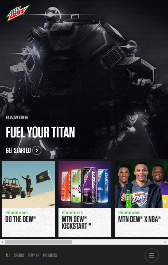
2. Mountain Dew

The desktop website of ABC provides several options: television schedule, names of Oscar winners, option to watch your favourite television show, and more.
However, it has simplified the user experience on the mobile website. There are not as many choices as the desktop version. Instead, you get large clickable images of the television shows. Users get the option to click on any of the show and get information related to it.
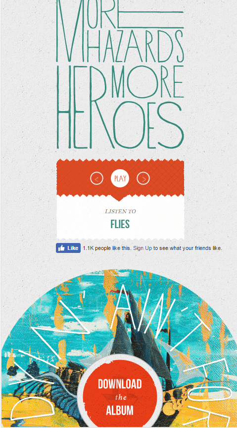
“More hazards more heroes” is a folk duo. In order to encourage visitors to download their album, they have kept an image link that is colourful right at the centre of the mobile page. In addition to downloading the album, it also gives options to listen to individual tracks.
5. Pack Dog
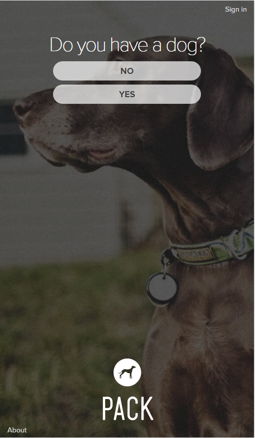
It may sound far-fetched, but this website helps you create a homepage for your dog. The best thing is that all the information is condensed in one single mobile homepage. There is nothing for the visitors to think, except to click on the buttons given at the top.
Tools that let you explore the other side of responsive by triggering user engagement
- Conduct On-page surveys
Tool: Qualaroo
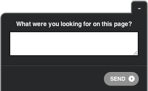
One of the best ways you could find out user’s preferences is by asking them directly. Continual pop-ups could be annoying. It is worth to ask people what they are looking for up-front when they visit your website.
- Split tests that help understand user intent
Tool: Optimizely
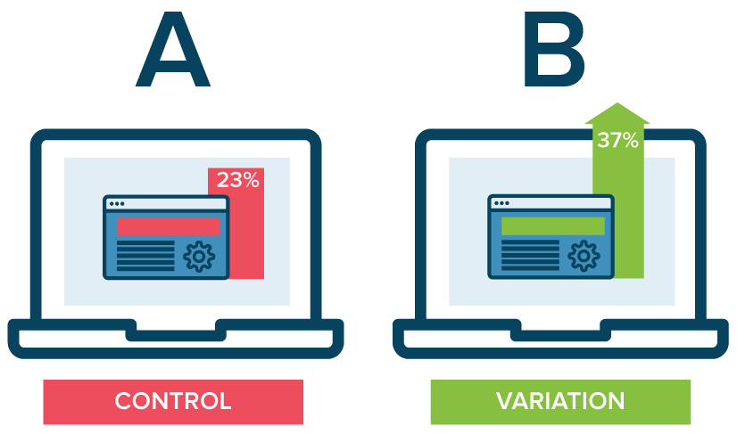
Keep a log of test results with the benchmarks before the test, the pages that were tested, and the perceived reason that a particular version of page won. From there on, you could think about what is implied based on your conclusion:
- What went wrong with the version that was low-performing?
- If our assumption about what the users want is right, are there any other pages impacted?
Do we have content that solves the user’s problems? Is some key information missing from the other versions?
- In-market segments
Tool: Google Analytics
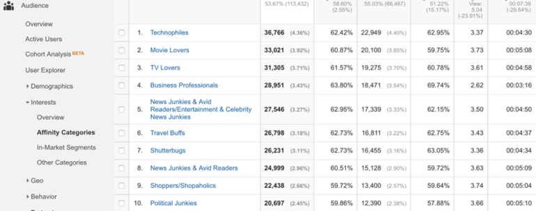
The in-market segment report doesn’t tell us what the users are buying. Instead it lets us know what other places the users are checking out. If you have a lifestyle website, this report gives you some valuable insights about the surfing behavior of users and what information you could provide from the mobile homepage rather than stuffing it with all kinds of information.
Conclusion
Responsive design may be the right option, but if it is not resonating with the decision makers – the users – you are not going anywhere. Responsive is being implemented since long and it is not going to end, however users don’t just need websites that fit their screen size. They want websites that immediately respond to their needs.
At HubMonks, our certified COS and inbound marketing experts work together to create a union between responsive and the best inbound marketing methodology to create a great user experience for enhanced marketing results.
Let us know your views on the best marketing tactics that you have incorporated with your responsive design in the comments box.